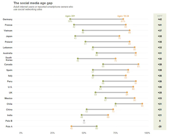
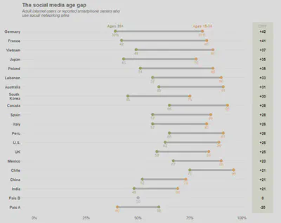
Dumbbell/Lolliplot of the social media age gap
 Image credit: Unknown
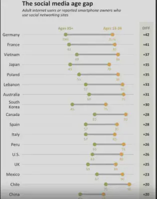
A friend of mine asked if I could replicate the following plot:

First, we load the packages and set the colors to be the same ones from the original plot (or at least, as close as possible).
# ************************************************************************* ----
# Packages                                                                  ----
# ************************************************************************* ----

#install.packages("tidyverse")

library("tidyverse")

# ************************************************************************* ----
# Colors - From the original plot                                           ----
# ************************************************************************* ----

orange <- "#e8ab5f"
green <- "#a1ad62"

background_diff <- "#eef0e2"

gray <- "#bbbbbb"
light_gray <- "#f4f4f4"
Now, we need to recreate the data. I did that as if the data were organized as follows:
#        Country Ages_35_plus Ages_18_34
# 1      Germany         0.39       0.81
# 2       France         0.42       0.83
# 3      Vietnam         0.49       0.86
# 4        Japan         0.43       0.78
# 5       Poland         0.51       0.86
# 6      Lebanon         0.57       0.90
# 7    Australia         0.60       0.91
# 8  South Korea         0.45       0.75
# 9       Canada         0.65       0.93
# 10       Spain         0.57       0.85
# 11       Italy         0.57       0.83
# 12        Peru         0.65       0.91
# 13        U.S.         0.63       0.89
# 14          UK         0.59       0.84
# 15      Mexico         0.67       0.90
# 16       Chile         0.75       0.96
# 17       China         0.52       0.73
# 18       India         0.48       0.69
# 19      Pais A         0.60       0.40
# 20      Pais B         0.50       0.50
I’ve included Pais A and Pais B so that I have one country with a negative difference, and another one
with a difference of zero.
# ************************************************************************* ----
# Data for Dotplot                                                          ----
# ************************************************************************* ----

original_df <-
  data.frame(
    Country = c("Germany", "France", "Vietnam", "Japan",
                "Poland", "Lebanon", "Australia",
                "South Korea", "Canada", "Spain", "Italy", "Peru", "U.S.",
                "UK", "Mexico", "Chile", "China", "India",
                "Pais A", "Pais B"
                ),
    Ages_35_plus = c(0.39, 0.42, 0.49, 0.43,
                     0.51, 0.57, 0.60,
                     0.45, 0.65, 0.57, 0.57, 0.65, 0.63,
                     0.59, 0.67, 0.75, 0.52, 0.48,
                     0.6, 0.5
                     ),
    Ages_18_34 = c(0.81, 0.83, 0.86, 0.78, 0.86, 0.90, 0.91,
                   0.75, 0.93, 0.85, 0.83, 0.91, 0.89,
                   0.84, 0.90, 0.96, 0.73, 0.69,
                   0.4, 0.5
                   )
  )
Given that, I needed to do 5 things before I started:
-
Insert a line break in
South Korea -
Calculate the age differences
-
Sort countries by their age differences
-
Set country names as factors so that we can plot it in the correct order.
-
Gather columns into key-value pairs (age groups).
## \__Line Break

original_df_v2 <-
  original_df %>%
  mutate(
    Country = ifelse(
      Country == "South Korea",
      # Value_if_True:
      "South \n Korea",
      # Value_if_False:
      as.character(Country))
  )

# _________________________________________________________________________ ====

## \__Calculate the age differences

base_diff <-
  original_df_v2 %>%
  mutate(
    Diferenca = Ages_18_34-Ages_35_plus
  ) %>%
  # Sort (descending), but that is OK as ggplot inverts the order
  arrange(Diferenca, desc(Country)) %>%
  # Create factors from the names of the ordered countries
  mutate(
    Country.fact = factor(Country, levels = unique(Country))
  )

# _________________________________________________________________________ ====

## \__Gather columns

df_diff_gather_age <-
  base_diff %>%
  gather(
    # Group Name
    key = Age_Group,
    # Name of the Variable to input the percentages of Age
    value = Age_Percent,
    # Age variables
    Ages_35_plus, Ages_18_34
  ) %>%
  # Reorder the variables in the database
  select(Country, Country.fact, Age_Group, Age_Percent, Diferenca)

#___________________________________________________________________________####

# ************************************************************************* ----
# Dot Plot                                                                  ----
# ************************************************************************* ----
p<-
ggplot(
  data = df_diff_gather_age,
  mapping = aes(
    # Y Axis
    y=Country.fact,
    # X Axis
    x=Age_Percent,
    # Groups with different colors
    # If difference is zero, put it into a third group
    color = ifelse(Diferenca == 0, "zero", Age_Group))
) +
  # Plot lines between points, by Country
  geom_line(
    mapping = aes(group = Country),
    color = gray,
    size = 2.5
  ) +
  geom_point(
    # Dot size
    size=4,
    # dot type. Important to be number 19, otherwise we cannot plot the dots
    # with the colors for different groups
    pch = 19
  ) +
  # Add % for each point
  geom_text(
    # Font size
    size = 4,
    # Set text a little below the dots
    nudge_y = -0.35,
    mapping =
      aes(
        label =
          # If country is Germany (the first one), plot numbers with %
          ifelse(Country == "Germany",
                 # Value_if_True:
                 paste0(as.character(round(Age_Percent*100,0)),"%"),
                 # Value_if_False
                 paste0(as.character(round(Age_Percent*100,0)))
                 ),
        color = ifelse(Diferenca == 0, "zero", Age_Group)

      )
  ) +
  # Add "Legend" above Germany (the first one)
  geom_text(
    # Font size
    size = 4,
    # Bold face
    fontface = "bold",
    # Set text a little above the dots
    nudge_y = 0.6,
    mapping =
      aes(
        label =
          # If Country is Germany, plot legend
          ifelse(Country == "Germany",
                 # Value_if_True:
                 ifelse(Age_Group == "Ages_35_plus",
                        # Value_if_True:
                        "Ages 35+",
                        # Value_if_False:
                        "Ages 18-34"
                        ),
                 # Value_if_False
                 ""
          ),
        color = ifelse(Diferenca == 0, "zero", Age_Group)
      )
  ) +
  # Change dot colors
  scale_color_manual(
    values = c(orange, green, "gray")
  ) +
  # Change scale x axis
  scale_x_continuous(
    # Set limits to 0 and 1.2 (we won't set it to 1 because we neeed some space
    # after 1 to place the values of the differences)
    limits = c(0,1.2),
    # Show tick marks at every 25%
    breaks = seq(0,1,.25),
    # Change scale to percent
    labels = scales::percent
  ) +
  # Expand y axis scale so that the legend can fit
  scale_y_discrete(
    expand = expand_scale(add=c(0.65,1))
  ) +
  # Add white rectangle to set the area where the values of the differences will
  # be
  geom_rect(
    mapping = aes(xmin = 1.01, xmax = Inf , ymin = -Inf, ymax = Inf),
    fill = "white",
    color = "white"
  ) +
  # Add rectangle with correct banground color for the differences
  geom_rect(
    mapping = aes(xmin = 1.05, xmax = 1.15 , ymin = -Inf, ymax = Inf),
    fill = background_diff,
    color = background_diff
  ) +
  # Add Differences values
  geom_text(
    # Bold face
    fontface = "bold",
    # Font size
    size = 4,
    # Font Color
    colour = "black",
    # Position
    mapping =
      aes(
        x = 1.1,
        y = Country,
        label =
          # To avoid duplicate values, plot empty text for the first group and
          # plot the difference only for the Ages_18_34 group.
          ifelse(Age_Group == "Ages_35_plus",
                 # Value_if_True
                 "",
                 #Value_if_False
                 # If the difference is equal to zero, do not put any signal.
                 # Otherwise, if Positive, put the + sign on the front.
                 ifelse(Diferenca == 0,
                        # Value_if_True:
                        paste0(as.character(round(Diferenca*100,0))),
                        # Value_if_False
                        ifelse(Diferenca > 0,
                               # Value_if_True
                               paste0("+",as.character(round(Diferenca*100,0))),
                               # Value_if_False
                               paste0(as.character(round(Diferenca*100,0)))
                        )
                 )
              )
      )
  ) +
  # Insert Title of Differences
  geom_text(
    # Bold face
    fontface = "bold",
    # Font size
    size = 4,
    # Cor
    colour = "gray",
    # Set text a little above the dots
    nudge_y = 0.6,
    # Position
    mapping =
      aes(
        x = 1.1,
        y = Country,
        label =
          # If Country is Germany, plot values
          ifelse(Country == "Germany",
                 # Value_if_True
                 "DIFF",
                 #Value_if_False
                 ""
          )
      )
  ) +
  # Plot Title and Axis Labels
  labs(
    title = "The social media age gap",
    subtitle = paste0(
      "Adult internet users or reported smartphone owners who \n",
      "use social networking sites"
      ),
    x = "",
    y = ""
    ) +
  # Change background, General font size, and other things
  theme(
    # Change font color and text for all text outside geom_text
    text = element_text(color = "#4e4d47", size = 14),

    # Country names in bold face
    axis.text.y = element_text(face = "bold"),

    # Add space between x axis text and plot
    axis.text.x = element_text(vjust = -0.75),

    # Do not show tick marks
    axis.ticks = element_blank(),

    # Delete original legend (keep only the one we created)
    legend.position = "none",

    # White background
    panel.background = element_blank(),

    # Country (y Axis) Lines
    panel.grid.major.y = element_line(colour = light_gray, size = 1),

    # Change Title Font
    plot.title = element_text(face = "bold", size = 16),

    # Change Subtitle Font and add some margin
    plot.subtitle = element_text(face = "italic", size = 12,
                                 margin = margin(b = 0.5, unit = "cm"))
  )
And the final plot:
