Waterfall chart in R
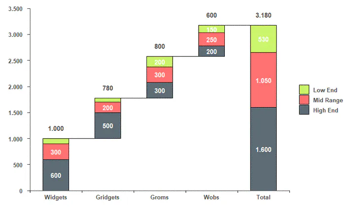 Image credit: Unknown
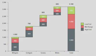
This plot was created in response to this question on StackOverflow. The objective is to replicate the following plot:
The trick to plot waterfall charts with ggplot2 is to create a data set with the groups (x values - I’m calling this in my code as x.axis.Var) in the exact order you want to plot. After that, you need to get the start and end points of the bars for each category (categories in your legend - cat.Var) within the groups. Then, you create another group with the totals by category. You’ll also need a numeric index for the groups to manipulate the bars. Finally, get a column with the total by group for the numbers above the bars.
df <- data.frame(
  x.axis.Var = rep(c("Widgets", "Gridgets", "Groms", "Wobs"), 3),
  cat.Var = rep(c("High End", "Mid Range", "Low End"), each = 4),
  values = c(
    600, 500, 300, 200, # high end
    300, 200, 300, 250, # mid range
    100, 80, 200, 150   # low end
  )
)
Or,
   x.axis.Var   cat.Var values
1     Widgets  High End    600
2    Gridgets  High End    500
3       Groms  High End    300
4        Wobs  High End    200
5     Widgets Mid Range    300
6    Gridgets Mid Range    200
7       Groms Mid Range    300
8        Wobs Mid Range    250
9     Widgets   Low End    100
10   Gridgets   Low End     80
11      Groms   Low End    200
12       Wobs   Low End    150
Follow the steps below to get a new data frame:
library('tidyverse')

df.tmp <- df %>%
  # \_Set the factor levels in the order you want ----
  mutate(
    x.axis.Var = factor(
      x.axis.Var,
      levels = c("Widgets", "Gridgets", "Groms", "Wobs")
    ),
    cat.Var = factor(
      cat.Var,
      levels = c("Low End", "Mid Range", "High End")
    )
  ) %>%
  # \_Sort by Group and Category ----
  arrange(x.axis.Var, desc(cat.Var)) %>%
  # \_Get the start and end points of the bars ----
  mutate(
    end.Bar = cumsum(values),
    start.Bar = c(0, head(end.Bar, -1))
  ) %>%
  # \_Add a new Group called 'Total' with total by category ----
  rbind(df %>%
    # \___Sum by Categories ----
    group_by(cat.Var) %>%
    summarise(values = sum(values)) %>%
    # \___Create new Group: 'Total' ----
    mutate(
      x.axis.Var = "Total",
      cat.Var = factor(
        cat.Var,
        levels = c("Low End", "Mid Range", "High End")
      )
    ) %>%
    # \___Sort by Group and Category ----
    arrange(x.axis.Var, desc(cat.Var)) %>%
    # \___Get the start and end points of the bars ----
    mutate(
      end.Bar = cumsum(values),
      start.Bar = c(0, head(end.Bar, -1))
    ) %>%
    # \___Put variables in the same order ----
    select(names(df),end.Bar,start.Bar)
  ) %>%
  # \_Get numeric index for the groups ----
  mutate(group.id = group_indices(., x.axis.Var)) %>%
  # \_Create new variable with total by group ----
  group_by(x.axis.Var) %>%
  mutate(total.by.x = sum(values)) %>%
  # \_Order the columns ----
  select(
    x.axis.Var, cat.Var, group.id, start.Bar, values, end.Bar,
    total.by.x
  )
This yields:
x.axis.Var cat.Var   group.id start.Bar values end.Bar total.by.x
   <fct>      <fct>        <int>     <dbl>  <dbl>   <dbl>      <dbl>
 1 Widgets    High End         1         0    600     600       1000
 2 Widgets    Mid Range        1       600    300     900       1000
 3 Widgets    Low End          1       900    100    1000       1000
 4 Gridgets   High End         2      1000    500    1500        780
 5 Gridgets   Mid Range        2      1500    200    1700        780
 6 Gridgets   Low End          2      1700     80    1780        780
 7 Groms      High End         3      1780    300    2080        800
 8 Groms      Mid Range        3      2080    300    2380        800
 9 Groms      Low End          3      2380    200    2580        800
10 Wobs       High End         4      2580    200    2780        600
11 Wobs       Mid Range        4      2780    250    3030        600
12 Wobs       Low End          4      3030    150    3180        600
13 Total      High End         5         0   1600    1600       3180
14 Total      Mid Range        5      1600   1050    2650       3180
15 Total      Low End          5      2650    530    3180       3180
Then, I can use the following code to get the plot that I want:
ggplot(df.tmp, aes(x = group.id, fill = cat.Var)) +
  # \_Simple Waterfall Chart ----
  geom_rect(
    aes(
      x = group.id,
      xmin = group.id - 0.25, # control bar gap width
      xmax = group.id + 0.25,
      ymin = end.Bar,
      ymax = start.Bar
    ),
    color="black",
    alpha=0.95
  ) +
  # \_Lines Between Bars ----
  geom_segment(
    aes(
      x = ifelse(
        group.id == last(group.id),
        last(group.id),
        group.id+0.25
      ),
      xend = ifelse(
        group.id == last(group.id),
        last(group.id),
        group.id+0.75
      ),
      y = ifelse(
        cat.Var == "Low End",
        end.Bar,
        max(end.Bar)*2 # these will be removed once we set the y limits
      ),
      yend = ifelse(
        cat.Var == "Low End",
        end.Bar,
        max(end.Bar)*2 # these will be removed once we set the y limits
      )
    ),
    colour="black"
  ) +
  # \_Numbers inside bars (each category) ----
  geom_text(
  mapping =
    aes(
      label = ifelse(values < 150, "", ifelse(
        nchar(values) == 3,
        as.character(values),
        sub("(.{1})(.*)", "\\1.\\2", as.character(values))
      )),
      y = rowSums(cbind(start.Bar, values / 2))
    ),
  color = "white",
  fontface = "bold"
) +
  # \_Total for each category above bars ----
geom_text(
  mapping =
    aes(
      label = ifelse(cat.Var != "Low End", "", ifelse(
        nchar(total.by.x) == 3,
        as.character(total.by.x),
        sub("(.{1})(.*)", "\\1.\\2", as.character(total.by.x))
      )),
      y = end.Bar + 200
    ),
  color = "#4e4d47",
  fontface = "bold"
) +
  # \_Change colors ----
scale_fill_manual(values = c('#c8f464', '#ff6969', '#55646e')) +
  # \_Change y axis to same scale as original ----
scale_y_continuous(
  expand = c(0, 0),
  limits = c(0, 3500),
  breaks = seq(0, 3500, 500),
  labels = ifelse(
    nchar(seq(0, 3500, 500)) < 4,
    as.character(seq(0, 3500, 500)),
    sub("(.{1})(.*)", "\\1.\\2", as.character(seq(0, 3500, 500)))
  )
) +
  # \_Add tick marks on x axis to look like the original plot ----
scale_x_continuous(
  expand = c(0, 0),
  limits = c(min(df.tmp$group.id) - 0.5, max(df.tmp$group.id) + 0.5),
  breaks = c(
    min(df.tmp$group.id) - 0.5,
    unique(df.tmp$group.id),
    unique(df.tmp$group.id) + 0.5
  ),
  labels =
    c("", as.character(unique(df.tmp$x.axis.Var)), rep(c(""), length(
      unique(df.tmp$x.axis.Var)
    )))
) +
  # \_Theme options to make it look like the original plot ----
theme(
  text = element_text(size = 14, color = "#4e4d47"),
  axis.text = element_text(
    size = 10,
    color = "#4e4d47",
    face = "bold"
  ),
  axis.text.y = element_text(margin = margin(r = 0.3, unit = "cm")),
  axis.ticks.x =
    element_line(
      color = c(
        "black",
        rep(NA, length(unique(df.tmp$x.axis.Var))),
        rep("black", length(unique(df.tmp$x.axis.Var)) - 1)
      )
    ),
  axis.line = element_line(colour = "#4e4d47", size = 0.5),
  axis.ticks.length = unit(.15, "cm"),
  axis.title.x =       element_blank(),
  axis.title.y =       element_blank(),
  panel.background =   element_blank(),
  plot.margin =        unit(c(1, 1, 1, 1), "lines"),
  legend.text =        element_text(
    size = 10,
    color = "#4e4d47",
    face = "bold",
    margin = margin(l = 0.25, unit = "cm")
  ),
  legend.title =       element_blank()
)
And the final plot: