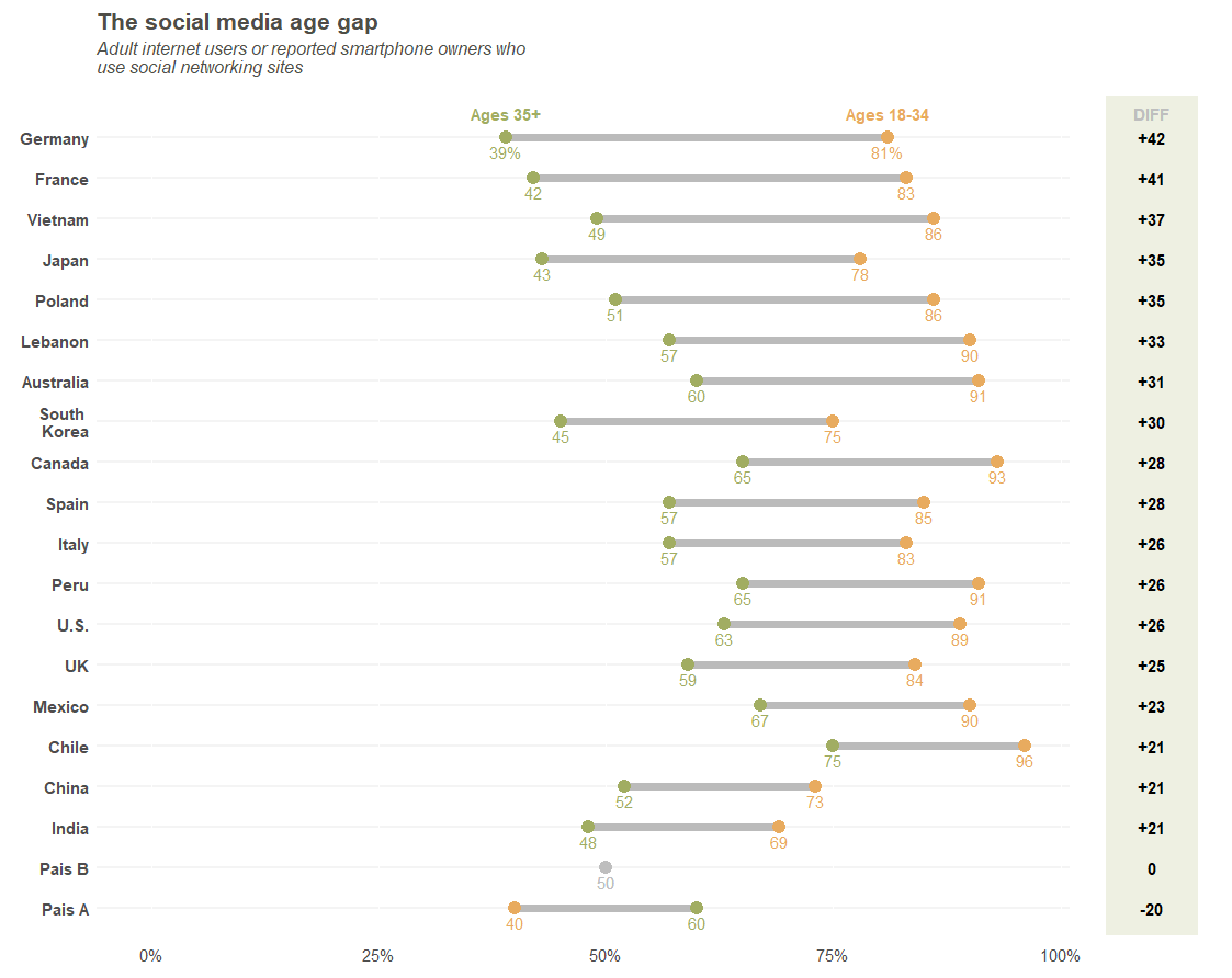
A friend of mine asked if I could replicate the following plot:
First, we load the packages and set the colors to be the same ones from the original plot (or at least, as close as possible).
# ************************************************************************* ----
# Packages                                                                  ----
# ************************************************************************* ----

#install.packages("tidyverse")

library("tidyverse")

# ************************************************************************* ----
# Colors - From the original plot                                           ----
# ************************************************************************* ----

orange <- "#e8ab5f"
green <- "#a1ad62"

background_diff <- "#eef0e2"

gray <- "#bbbbbb"
light_gray <- "#f4f4f4"
Now, we need to recreate the data. I did that as if the data were organized as follows:
#        Country Ages_35_plus Ages_18_34
# 1      Germany         0.39       0.81
# 2       France         0.42       0.83
# 3      Vietnam         0.49       0.86
# 4        Japan         0.43       0.78
# 5       Poland         0.51       0.86
# 6      Lebanon         0.57       0.90
# 7    Australia         0.60       0.91
# 8  South Korea         0.45       0.75
# 9       Canada         0.65       0.93
# 10       Spain         0.57       0.85
# 11       Italy         0.57       0.83
# 12        Peru         0.65       0.91
# 13        U.S.         0.63       0.89
# 14          UK         0.59       0.84
# 15      Mexico         0.67       0.90
# 16       Chile         0.75       0.96
# 17       China         0.52       0.73
# 18       India         0.48       0.69
# 19      Pais A         0.60       0.40
# 20      Pais B         0.50       0.50
I’ve included Pais A and Pais B so that I have one country with a negative difference, and another one
with a difference of zero.
# ************************************************************************* ----
# Data for Dotplot                                                          ----
# ************************************************************************* ----

original_df <-
  data.frame(
    Country = c("Germany", "France", "Vietnam", "Japan",
                "Poland", "Lebanon", "Australia",
                "South Korea", "Canada", "Spain", "Italy", "Peru", "U.S.",
                "UK", "Mexico", "Chile", "China", "India",
                "Pais A", "Pais B"
                ),
    Ages_35_plus = c(0.39, 0.42, 0.49, 0.43,
                     0.51, 0.57, 0.60,
                     0.45, 0.65, 0.57, 0.57, 0.65, 0.63,
                     0.59, 0.67, 0.75, 0.52, 0.48,
                     0.6, 0.5
                     ),
    Ages_18_34 = c(0.81, 0.83, 0.86, 0.78, 0.86, 0.90, 0.91,
                   0.75, 0.93, 0.85, 0.83, 0.91, 0.89,
                   0.84, 0.90, 0.96, 0.73, 0.69,
                   0.4, 0.5
                   )
  )
Given that, I needed to do 5 things before I started:
1) Insert a line break in South Korea
2) Calculate the age differences
3) Sort countries by their age differences
4) Set country names as factors so that we can plot it in the correct order.
5) Gather columns into key-value pairs (age groups).
## \__Line Break

original_df_v2 <-
  original_df %>%
  mutate(
    Country = ifelse(
      Country == "South Korea",
      # Value_if_True:
      "South \n Korea",
      # Value_if_False:
      as.character(Country))
  )

# _________________________________________________________________________ ====

## \__Calculate the age differences

base_diff <-
  original_df_v2 %>%
  mutate(
    Diferenca = Ages_18_34-Ages_35_plus
  ) %>%
  Sort (descending), but that's OK as ggplot inverts the order
  arrange(Diferenca, desc(Country)) %>%
  # Create factors from the names of the ordered countries
  mutate(
    Country.fact = factor(Country, levels = unique(Country))
  )

# _________________________________________________________________________ ====

## \__Gather columns

df_diff_gather_age <-
  base_diff %>%
  gather(
    # Group Name
    key = Age_Group,
    # Name of the Variable to input the percentages of Age
    value = Age_Percent,
    # Age variables
    Ages_35_plus, Ages_18_34
  ) %>%
  # Reorder the variables in the database
  select(Country, Country.fact, Age_Group, Age_Percent, Diferenca)

#___________________________________________________________________________####

# ************************************************************************* ----
# Dot Plot                                                                  ----
# ************************************************************************* ----
p<-
ggplot(
  data = df_diff_gather_age,
  mapping = aes(
    # Y Axis
    y=Country.fact,
    # X Axis
    x=Age_Percent,
    # Groups with different colors
    # If difference is zero, put it into a third group
    color = ifelse(Diferenca == 0, "zero", Age_Group))
) +
  # Plot lines between points, by Country
  geom_line(
    mapping = aes(group = Country),
    color = gray,
    size = 2.5
  ) +
  geom_point(
    # Dot size
    size=4,
    # dot type. Important to be number 19, otherwise we cannot plot the dots
    # with the colors for different groups
    pch = 19
  ) +
  # Add % for each point
  geom_text(
    # Font size
    size = 4,
    # Set text a little below the dots
    nudge_y = -0.35,
    mapping =
      aes(
        label =
          # If country is Germany (the first one), plot numbers with %
          ifelse(Country == "Germany",
                 # Value_if_True:
                 paste0(as.character(round(Age_Percent*100,0)),"%"),
                 # Value_if_False
                 paste0(as.character(round(Age_Percent*100,0)))
                 ),
        color = ifelse(Diferenca == 0, "zero", Age_Group)

      )
  ) +
  # Add "Legend" above Germany (the first one)
  geom_text(
    # Font size
    size = 4,
    # Bold face
    fontface = "bold",
    # Set text a little above the dots
    nudge_y = 0.6,
    mapping =
      aes(
        label =
          # If Country is Germany, plot legend
          ifelse(Country == "Germany",
                 # Value_if_True:
                 ifelse(Age_Group == "Ages_35_plus",
                        # Value_if_True:
                        "Ages 35+",
                        # Value_if_False:
                        "Ages 18-34"
                        ),
                 # Value_if_False
                 ""
          ),
        color = ifelse(Diferenca == 0, "zero", Age_Group)
      )
  ) +
  # Change dot colors
  scale_color_manual(
    values = c(orange, green, "gray")
  ) +
  # Change scale x axis
  scale_x_continuous(
    # Set limits to 0 and 1.2 (we won't set it to 1 because we neeed some space
    # after 1 to place the values of the differences)
    limits = c(0,1.2),
    # Show tick marks at every 25%
    breaks = seq(0,1,.25),
    # Change scale to percent
    labels = scales::percent
  ) +
  # Expand y axis scale so that the legend can fit
  scale_y_discrete(
    expand = expand_scale(add=c(0.65,1))
  ) +
  # Add white rectangle to set the area where the values of the differences will
  # be
  geom_rect(
    mapping = aes(xmin = 1.01, xmax = Inf , ymin = -Inf, ymax = Inf),
    fill = "white",
    color = "white"
  ) +
  # Add rectangle with correct banground color for the differences
  geom_rect(
    mapping = aes(xmin = 1.05, xmax = 1.15 , ymin = -Inf, ymax = Inf),
    fill = background_diff,
    color = background_diff
  ) +
  # Add Differences values
  geom_text(
    # Bold face
    fontface = "bold",
    # Font size
    size = 4,
    # Font Color
    colour = "black",
    # Position
    mapping =
      aes(
        x = 1.1,
        y = Country,
        label =
          # To avoid duplicate values, plot empty text for the first group and
          # plot the difference only for the Ages_18_34 group.
          ifelse(Age_Group == "Ages_35_plus",
                 # Value_if_True
                 "",
                 #Value_if_False
                 # If the difference is equal to zero, do not put any signal.
                 # Otherwise, if Positive, put the + sign on the front.
                 ifelse(Diferenca == 0,
                        # Value_if_True:
                        paste0(as.character(round(Diferenca*100,0))),
                        # Value_if_False
                        ifelse(Diferenca > 0,
                               # Value_if_True
                               paste0("+",as.character(round(Diferenca*100,0))),
                               # Value_if_False
                               paste0(as.character(round(Diferenca*100,0)))
                        )
                 )
              )
      )
  ) +
  # Insert Title of Differences
  geom_text(
    # Bold face
    fontface = "bold",
    # Font size
    size = 4,
    # Cor
    colour = "gray",
    # Set text a little above the dots
    nudge_y = 0.6,
    # Position
    mapping =
      aes(
        x = 1.1,
        y = Country,
        label =
          # If Country is Germany, plot values
          ifelse(Country == "Germany",
                 # Value_if_True
                 "DIFF",
                 #Value_if_False
                 ""
          )
      )
  ) +
  # Plot Title and Axis Labels
  labs(
    title = "The social media age gap",
    subtitle = paste0(
      "Adult internet users or reported smartphone owners who \n",
      "use social networking sites"
      ),
    x = "",
    y = ""
    ) +
  # Change background, General font size, and other things
  theme(
    # Change font color and text for all text outside geom_text
    text = element_text(color = "#4e4d47", size = 14),

    # Country names in bold face
    axis.text.y = element_text(face = "bold"),

    # Add space between x axis text and plot
    axis.text.x = element_text(vjust = -0.75),

    # Do not show tick marks
    axis.ticks = element_blank(),

    # Delete original legend (keep only the one we created)
    legend.position = "none",

    # White background
    panel.background = element_blank(),

    # Country (y Axis) Lines
    panel.grid.major.y = element_line(colour = light_gray, size = 1),

    # Change Title Font
    plot.title = element_text(face = "bold", size = 16),

    # Change Subtitle Font and add some margin
    plot.subtitle = element_text(face = "italic", size = 12,
                                 margin = margin(b = 0.5, unit = "cm"))
  )

p
And the final plot: